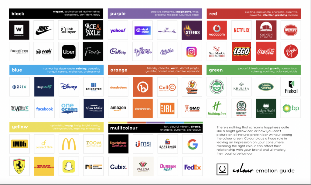
Colour Perception
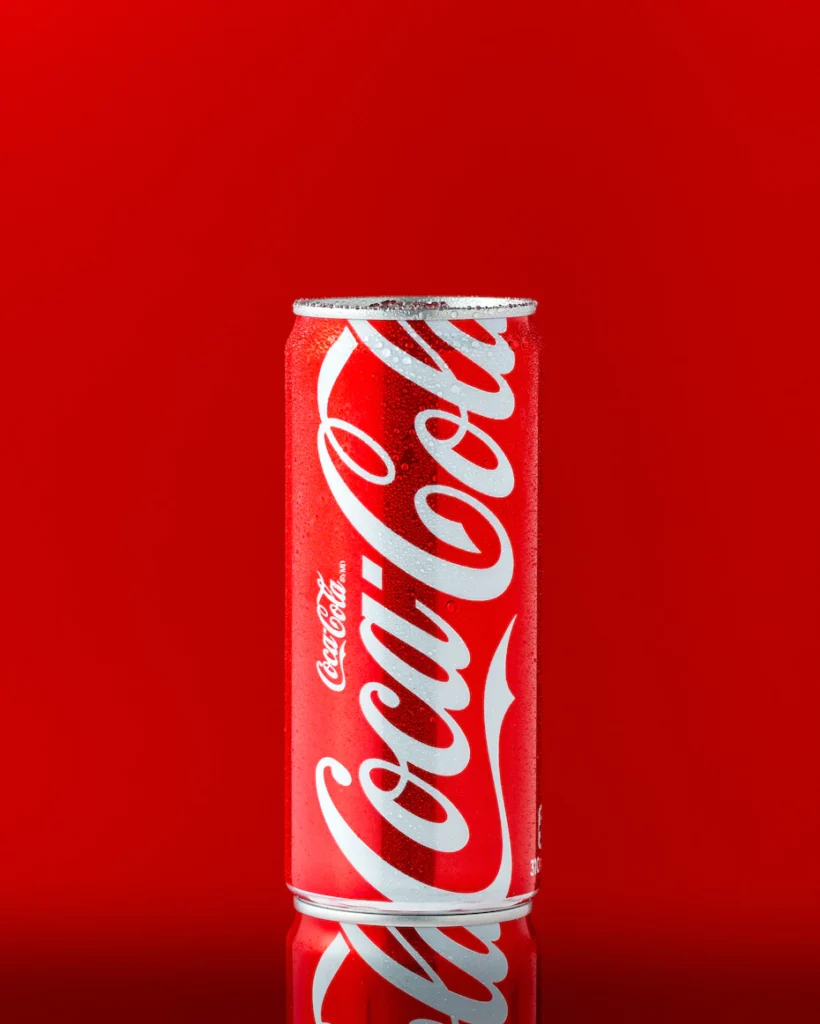
Subconsciously, colour shapes our perception of the world around us. Our brains process visual signals, enabling us to distinguish and assign meaning to different colours. But have you ever wondered what occurs in your brain when you encounter colour? How do various colours influence your emotions and behaviour? Consider the iconic Coca-Cola brand. Its timeless red hue has become synonymous with positivity, fun, and energy. This example highlights the profound impact that brand colours can have on evoking specific emotions and associations.
Colour psychology delves into how colours influence our perception of the world. Colours possess a remarkable ability to impact our emotions, subsequently shaping our behaviours as consumers. Astonishingly, WGSN reports that up to 90% of snap judgments made about products are solely based on colour.
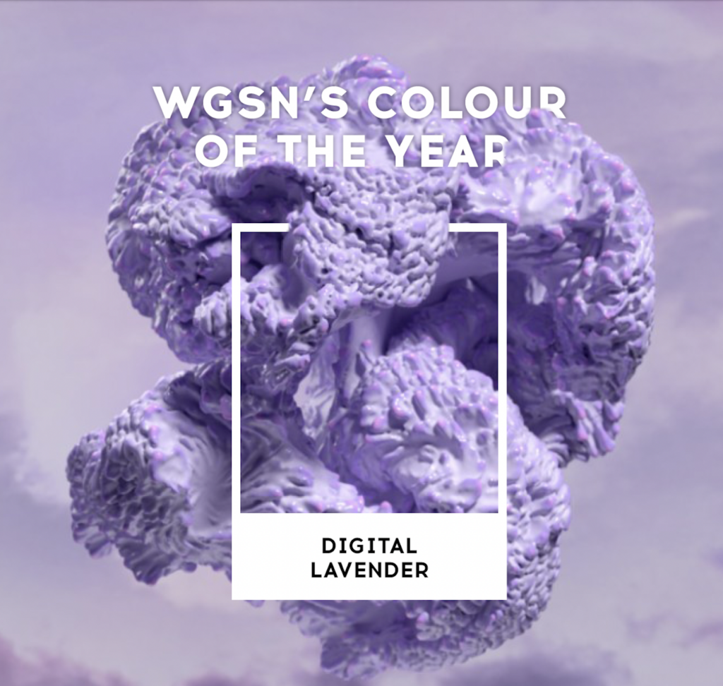
The Rise of Digital Lavender
In recent news, Digital Lavender has been crowned the colour of the year for 2023 by WGSN. This captivating shade is linked to calmness and serenity, making it a prominent choice since people are regaining their freedom after lockdown, and consumers prioritise their health and well-being. Not only is this colour going to become popular in fashion and technology, you might notice how it becomes a positive association in our minds and synonymous with something good. This is a clear example of how colour and trends play an important role in our decision-making process.
The Influence of Culture on Colour
It’s fascinating to note that the effects of colour on mood and behaviour can vary depending on individual differences and cultural context. For instance, Western cultures often associate black with mourning and sadness, while in some Eastern cultures, it represents power and elegance. Similarly, white signifies purity and innocence in Western cultures, but it symbolises death and mourning in certain Eastern cultures.
Providing Memorable Brand Experiences
Because of this, colour psychology provides an invaluable framework for understanding how we interact with the brands that shape our lives. It is a potent tool that enables the creation of more meaningful and unforgettable brand experiences. Research even suggests that colour can enhance brand recognition by an impressive 80%.
When choosing what colours you want for your brand, there are key things you need to consider. As discussed above, presenting yourself in a way that your consumer’s resonate with and relate to is everything, and that means carefully selecting the right colours that communicate your message without saying anything at all. Let’s run through some important factors to remember:
Authenticity: Choose colours that align authentically with your brand. While stepping outside of expectations can be beneficial for challenging the status quo, it’s crucial to remain mindful of your audience’s preferences and expectations. An example of a brand choosing colours that align authentically with their brand is Patagonia. Patagonia, an outdoor clothing and gear company, uses earthy and nature-inspired colours like greens, browns, and blues. These colours reflect their commitment to environmental sustainability and their connection to outdoor adventures.


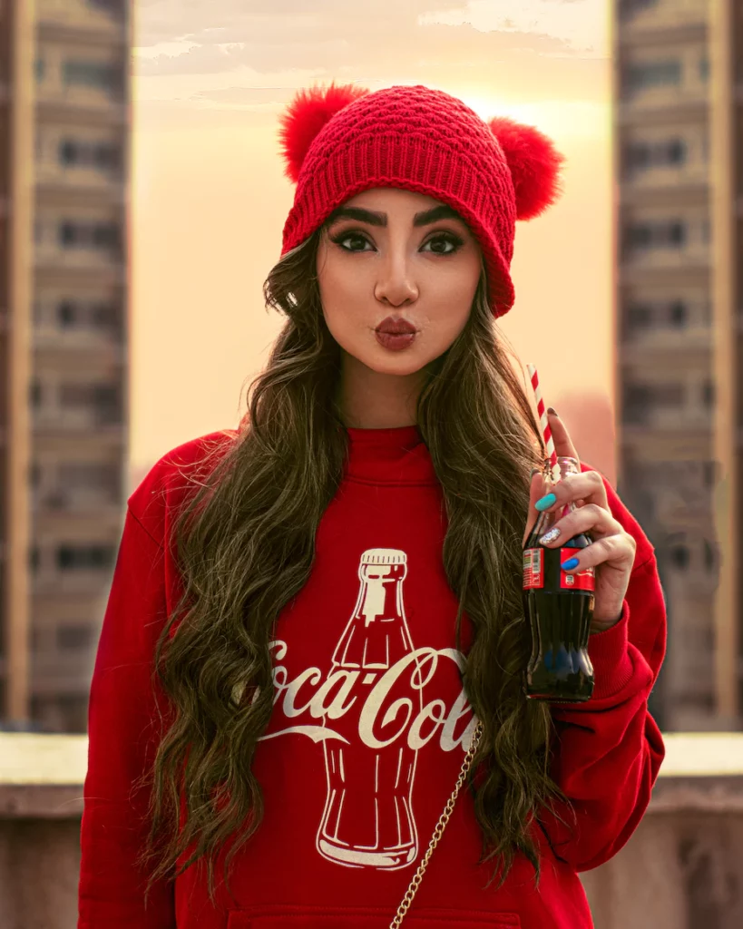
Reflecting Brand Personality: Your brand personality is the aspect of your brand that audiences connect with on a human level. When selecting colours, consider how they embody your brand’s unique personality traits. Referencing the same example as above, Coca-Cola is a brand that effectively reflects its personality through their choice of colours. Their vibrant colours reflect a bold, dynamic personality that encourages a fullness of life.

Resonating with Your Audience: Customer research is an indispensable tool for understanding those you serve. Building a buyer persona can help you identify which colours are likely to resonate with your target audience and evoke a positive response.
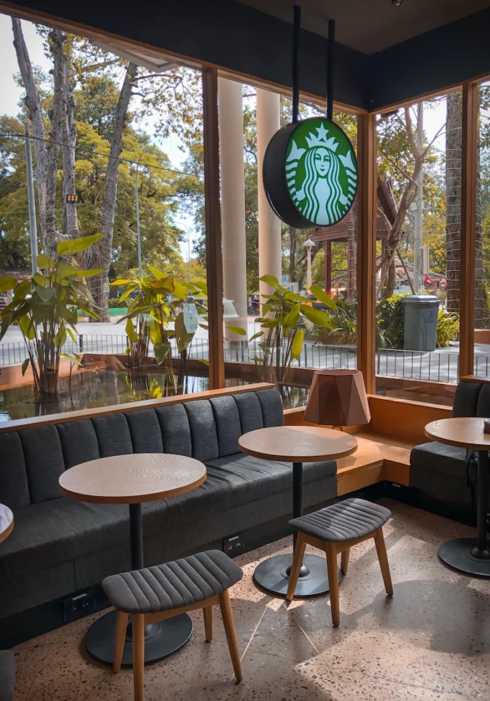
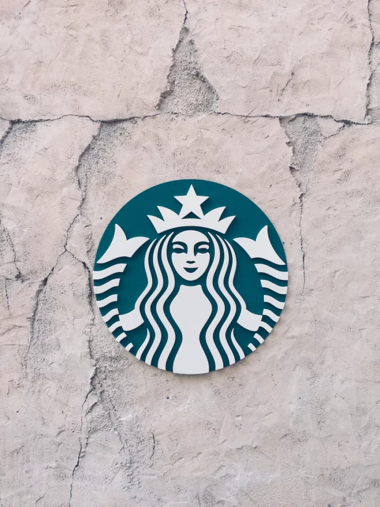
Starbucks is a brand that has chosen colours to resonate with its audience. The brand predominantly uses shades of green in its logo, store design, and packaging. Green is associated with nature, freshness, and sustainability, which aligns with Starbucks’ focus on sourcing ethical and sustainable coffee. Additionally, the green colour evokes a sense of relaxation and comfort, creating a welcoming environment for customers to enjoy their coffee. By selecting green as their primary colour, Starbucks appeals to their target audience of coffee lovers who value quality, sustainability, and a cosy atmosphere.

Ultimately, the power of colour psychology in branding cannot be underestimated. Colour has a profound impact on our emotions, perceptions, and behaviours as consumers. It plays a crucial role in shaping brand personality, resonating with target audiences, and creating memorable brand experiences. Understanding the authentic alignment between your brand and colours is essential, as it allows you to communicate your message effectively while considering your audience’s expectations.
At Coffee Creative Studio, we understand the significance of selecting the right colours for your brand. Contact us today to get in touch and discover how we can assist you in creating a powerful visual identity for your brand.
See related projects >