The Influence of Fonts on Perception and Design
There are over half a million fonts in the world. Like other design elements, fonts influence how readers perceive the text, a product, or even the entire website. Everything we read on a screen, book, magazine, or packaging label sparks our subconscious cognition. Font psychology taps into the connection between the appearance of words and how our brain processes, retains, and makes associations with them.
Typeface vs. Font – Understanding the Difference
First things first, what’s the difference between a typeface and a font? Fonts are variations within a typeface, like italics or bold. So, 12-point Helvetica is a font, and 10-point Helvetica Bold is a separate font within the same typeface.
The Impact on Human Emotions and Perception
Typography is an essential aspect of visual communication, influencing the way we perceive and interpret information. Font psychology is the study of how different typefaces impact human emotions and perception. The main psychological factor in typography is the deep cultural cues ingrained in the letters’ forms and shapes. Thousands of years of history and the evolution of language are ingrained in all the fonts we use today.
Therefore, proper font choices fuel your user experience and ultimately affect the design side of your conversion rate optimization. Fonts, typography, and letters tell stories and transmit feelings and emotions. They aren’t just an add-on to a visual in a design; they are part of the overall story.
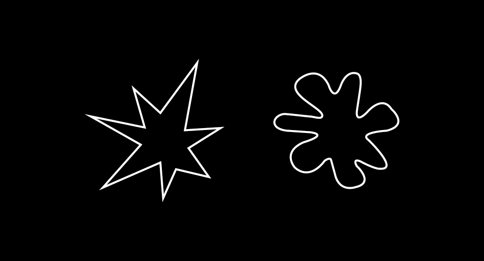
Take a look at the two shapes below. Now pick which one you associate with the word “Kiki” and which one with the word “Bouba.” Most of you probably chose the pointy shape for “Kiki” and the bubbly shape for “Bouba.” The word “Kiki” sounds pointy and sharp, while “Bouba” is round and feels like a bubble. In the psychology of shapes, triangles represent motion and hierarchy, while circles are completion, comfort, and endless cycles. The shapes, sounds, and cultural associations, all together, inspire emotions and feelings in the viewer.
Typography in History and Human Evolution
Fonts, or typography in general, have evolved through history alongside humanity — changing, transforming, and adapting to the consequences. In fact, the first typeface was a Blackletter variety used by Johannes Gutenberg on the first printing press, starting in 1440. This typeface design was created to mimic the calligraphic handwriting used by monks to hand-transcribe manuscripts prior to the invention of the printing press. What we know of typography and fonts now is a rich combination of everything humans have experienced since we could capture information into shapes that others could understand.
Understanding the Personality of Typefaces
A typeface consists of various distinguishable parts, such as serif, sans-serif, aperture, ascender, baseline, cap height, descender, leading, letter spacing, stem, stroke, and x-height.
When you think about serif fonts, you might think of them as smartly dressed people in button-up shirts with collars and fancy shoes. Words you could think of to describe these fonts are elegant and authoritarian. Serif typefaces scored the highest on traits such as “stable, practical, mature, and formal”.
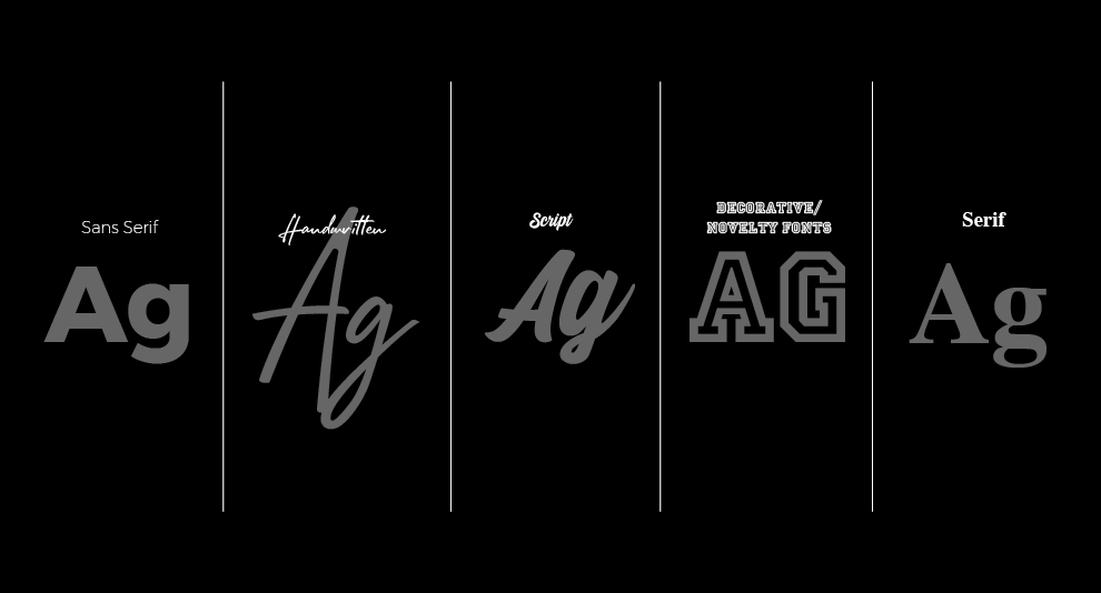
A sans serif is easy-going, upbeat and wears loose and casual clothing. There are different nuances to sans serif fonts; some feel very circular, while others are thin and elongated. Most brands use sans serif fonts to feel more relatable and approachable to their consumers. Sans-serifs did not score extremely high or low on any of the personality traits listed, which makes them both natural and all-purpose in a sense.
Handwritten fonts are youthful and informal. They’re like your neighbour coming over for a casual drink. They can come across as uncomplicated if used in the correct way and they can be great for human connection.
Script fonts are varied – they can be elegant or casual. You can think of them as ballet dancers and contemporary performers. Script fonts were seen as youthful, happy, creative, rebellious, feminine, casual, and cuddly in this study.
Think of decorative and novelty fonts as the rebels, the cool kids of the bunch. You could say they are the least subtle of the typeface families because they wear their hearts on their sleeves and tell a story immediately.
The Software Usability Research Laboratory (SURL) at Wichita State University tried to understand how people perceive typefaces. They asked participants to complete a questionnaire detailing which characteristics describe and resonate with different fonts, in their opinion.
Serif Fonts: Smart, Elegant, and Authoritative
Sans-serif Fonts: Easy-going and Approachable
Handwritten Fonts: Youthful and Informal
Script Fonts: Varied, Elegant, or Casual
Decorative and Novelty Fonts: Bold and Expressive
The Importance of Fonts in User Interface Design
Typeface psychology plays a significant role in User Interface (UI) design, impacting users’ interactions and impressions. The choice of typeface is crucial for creating an attractive UI design that triggers user engagement. Alongside other graphic elements, the typeface contributes to the overall design concept. For example, when designing a food application, a simple yet playful typeface with colours like red or yellow can evoke hunger, supplemented by a geometric or sans-serif typeface to enhance attractiveness. Making the right decision in typeface selection can drive users to interact more with the design.
Additionally, typeface design influences user perception and legibility, allowing designers to enhance user belief in the design. Typefaces can also help express personality within a design, creating a distinct characteristic that sets it apart. The script logo of Coca-Cola serves as a prime example, embodying the brand’s recognition and awareness through its calligraphic script logo with unique slants.
“Choosing the right font for your brand is so much more than something that looks good. It’s the tone and feel you want to send out, and with that, the people you want your business to attract. Imagine it like this – all fonts are milkshakes, it’s a delicious treat that can go with a meal or stand alone. Then the font type is your milkshake flavour, completely transforming the milkshake – you can have a fun, playful bubblegum shake, a classic, minimal vanilla shake, or a sophisticated, chic salted caramel gourmet shake. If your business is ‘the yard’ – it’s about choosing the correct flavour to bring all the ‘right people’ to your yard.” – Tam Locke, Art Director at Coffee Creative Studio
Fonts are more than just aesthetic choices in design. They hold the power to influence perception, evoke emotions, and enhance user experiences. From the elegant authority of serif fonts to the approachable nature of sans-serif fonts, each typeface has its own distinct characteristics. By making thoughtful typeface selections, designers can create visually appealing user interfaces that trigger engagement and convey brand personalities.
See related projects >